library(dplyr)
library(tidyr)
library(ggplot2)
library(reactable)
library(plotly)
library(crosstalk)6 - ggplot2, plotly, htmlwidgets, crosstalk
Setup
Today we look at some ways to make our data slightly more interactive for the web without the full power of web development in R Shiny.
First we load in some libraries.
ggplot2
ggplot2 creates 2D graphs.
Directions
- State the data frame. Then add an “aesthetics” of which data frame columns to serve as x-, y-axis:
ggplot(df,
    aes(x = col1, y = col2, color = ..., fill = ..., size = ..., shape = ...) +
    options below +
    more options below +
    etc.
)- Add graph types, like:
geom_histogram()geom_bar()andgeom_col()geom_dotplot()geom_point()geom_line()geom_boxplot()
- Add etc.
- Add labels
labs(title = ..., x = ..., y = ..., color = ...) - Add theme:
theme_bw(),theme_dark(),theme_minimal(), etc.
- Add labels
Example
Use the Billboard Songs database and the top positions of their songs, available at https://manctsui.github.io/datasets/charts.csv.
Plot the number of weeks song is on the board vs their peak positions.
(Idea: Keep only distinct songs.)
df <- read.csv("https://manctsui.github.io/datasets/charts.csv") |>
    distinct(song, artist, .keep_all = TRUE)

plot <- ggplot(df, aes(weeks.on.board, peak.rank)) +
    geom_point()

plot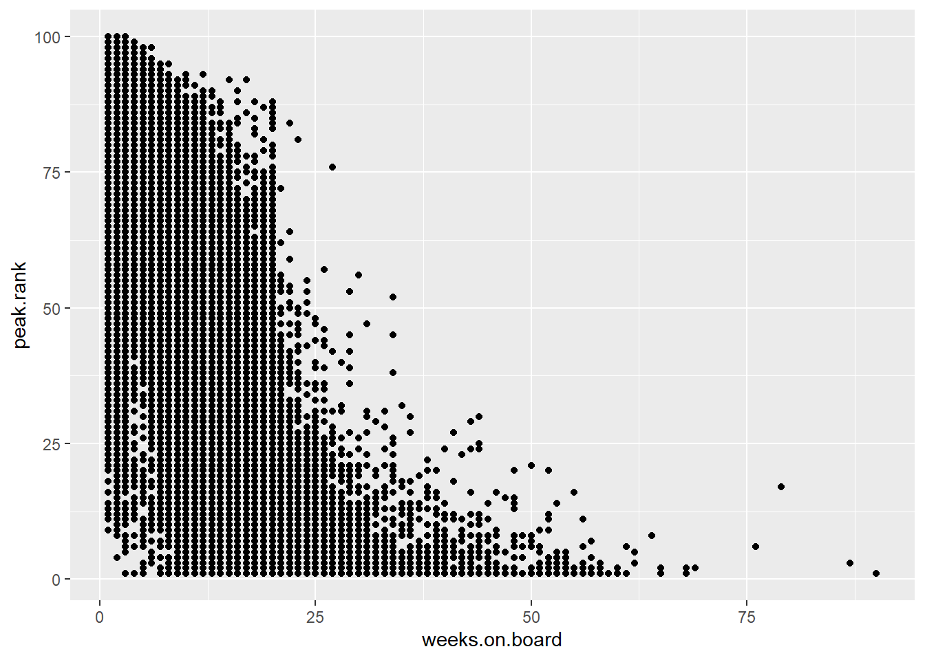
Plotly
plotly creates 2D and 3D graphs with interactivity.
Wrap a ggplot object with ggplotly() to get a plotly graph:
library(ggplot2)
library(plotly)

x <- c(1:100)
random_y <- rnorm(100, mean = 0)
data <- data.frame(x, random_y)

fig <- ggplot(data, mapping = aes(x = x, y = random_y)) +
    geom_line()

ggplotly(fig)
Or directly create graphs in plotly:
fig <- plot_ly(data, x = ~x, y = ~random_y, type = 'scatter', mode = 'lines')

fig
Types to choose from:
scatter– accounts for dotplots, scatterplots, line graphs, etc.scatter3dbarpiechoroplethmap of geographic regions shaded by intensity of data values- Sankey diagrams, etc.
Example
Repeat the ggplot2 example purely in plotly:
plot2 <- plot_ly(df, x = ~weeks.on.board, y= ~peak.rank, type = "scatter", mode = 'markers') |>
    layout(
        title = "Billboard Songs: Total Weeks vs Peak Rank",
        xaxis = list(title = "Total Weeks on Board"),
        yaxis = list(title = "Peak Rank")
    )

plot2
Leaflet
library(leaflet)

locations_df <- data.frame(
  name = c("Eiffel Tower", "Louvre Museum", "Notre-Dame"),
  lat  = c(48.8584, 48.8606, 48.8530),
  lng  = c(2.2945, 2.3376, 2.3499)
)

# Plotting all 3 markers simultaneously
leaflet(data = locations_df) |>
  addTiles() |>
  addMarkers(
    lng = ~lng,
    lat = ~lat,
    popup = ~name # Adds clickable text popups
  )
HTML Widgets
plotly and leaflet are actually JavaScript libraries. The R package htmlwidgets allows developers write R bindings to access these JS libraries.
This means you can pick from many widgets to use in R without needing to use JS.
Crosstalk
Crosstalk does linked brushing: selecting data points in one widget automatically selects the same data points in a shared widget.
Directions:
Pick a column
df$colof a data framedfthat uniquely identifies each row: this column serves as a key.Upgrade our data frame
dfto aSharedDataobject and store it as a variablesd <- SharedData$new(df, key = ~col)The
~is used here because key expects a formula not a variable name as input.Use this
SharedDataobjectsdas you would use a data frame withinggplot2,plotly,DT,reactable,leaflet, etc.
Crosstalk also comes with the following inputs; some arguments are shown:
filter_slider(id, label, sharedData, column, min, max)filter_select(id, label, sharedData, group)filter_checkbox(id, label, sharedData, group)
Here:
idis the HTML id of the input, so you can reference this input object.labelis the name of this input that shows up.sharedDatais your upgraded data framegroupandcolumn: the formula or data frame column that is shared between widgets.
Example
Display songs by Ed Sheeran, Adele, and Taylor Swift from the Billboard Songs database as well as the top positions of their songs as a table. Include a filter checkbox that toggles based on the selected artists to restrict our table.
specific_artists <- read.csv("https://manctsui.github.io/datasets/charts.csv") |>
    filter(artist %in% c("Ed Sheeran", "Adele", "Taylor Swift")) |>
    distinct(song, artist, peak.rank)

sd <- SharedData$new(specific_artists, key = ~song)

filter_checkbox("artist_checkbox", "Artist", sd, ~artist)reactable(sd, defaultPageSize = 4)Example, improved
We can make the above look nicer by arranging the widgets into columns with crosstalk’s bscols (Bootstrap columns) function. Read the documentations and an example of its use if you want to learn more.
bscols(
    filter_checkbox("artist_checkbox", "Artist", sd, ~artist),
    reactable(sd, defaultPageSize = 4),
    widths = c(4,8)
)Caveats
- Not all HTML widgets support crosstalk.
- For full reactivity, use Shiny for R.
Reference
- Documentation for crosstalk esp.
filter_slider,filter_select, andfilter_checkbox(underfilter_slider). - Tutorial
- Examples